
Principal Component Analysis
Recently, I worked on a project that necessitated data exploration and preprocessing. Principal component analysis (PCA) is technique I had heard about and seen used many times before; however, I personally had no experience with it in either theory or practice. So I got to digging.
Now the point of this post is not to give a full-fledged lesson on PCA. Many others have done that in better ways than I could manage. But to provide context, I’ll give a brief overview.
PCA performs an affine transformation on the standard Cartesian basis. In the transformed basis, the origin is centered in the data and most of the variance in the data is in the direction of the new axes. In two dimensions, imagine there are a few data points scattered on a plot. Make a plus sign with your fingers and let it overlap the x- and y-axis of that plot, then shift the intersection of your fingers to the middle of the data and rotate them to best align with the linear trend of the data. In higher dimensions, an affine transformation is still just a shift (i.e. translation) and a rotation, but the concept is difficult to visualize.
Suppose the original data contains has features \(x\), \(y\), and \(z\). Using PCA, those features are transformed to \(a, b, c\), each a linear combination of \(x, y, z\). An example of such a transformation is \(a = 3x - 2y + z\). Throughout this article, I will refer to “feature contributions”. In this example, the \(x\) feature makes a contribution of 3 to \(a\), \(y\) makes a contribution of -2, and \(z\) just 1. Though \(y\)’s contribution is -2, it is still a larger contribution in magnitude than the \(z\)’s 1.
Now let’s proceed to the motivation for this post. In my research, I came across this excellent article that describes PCA. I had just one critique about this article – near the end, there is a heatmap illustration that falls a bit short on illustrating the contributions of the original data features to the principal components. In a few lines of Python code, we can create a near reproduction.
|
|
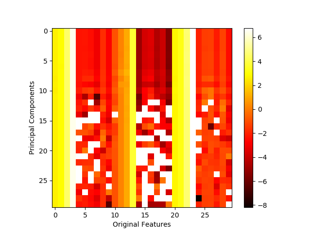
At first glance, nothing seems wrong with this image. However, several of the white squares in the heatmap are misleading – they do not actually indicate strong contributions as the colorbar suggests. Rather, those squares indicate NaN (not a number) placeholder values resulting from the attempt to take the log of a negative value, a result that is formally undefined. (Note the exponential scale of the colorbar, i.e. 6 means 1e6 and -8 means 1e-8 which is a very small, but positive number). The offending line is highlighted in the code snippet above.
This creates a conflict. Log scale is appropriate for this context, but the PCA inverse transform is likely to have at least one negative value. And it is virtually a certainty for the inverse transform to contain negative values when the data has been normalized (depending on the normalization method).
So are we out of luck? If you’ve made it this far, you’ll be happy to know the
answer is a resounding no! In fact, matplotlib has features that specifically
address this issue – matplotlib.colors.LogNorm and
matplotlib.colors.SymLogNorm. Using these mechanisms, I developed the
following function for properly displaying such a heatmap visualization.
Note: The code blocks in the remainder of this post all depend on imports, functions, etc. that have been defined in previous code blocks.
|
|
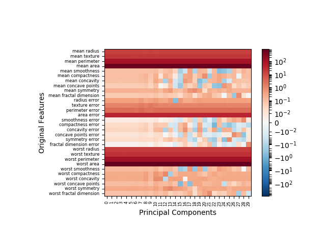
This method is robust in the case of negative values. Moreover, the option to
toggle signed contributions (positive vs. negative), as opposed to absolute
magnitude of contribution, is available through the signed argument.
There is also a sort argument that will cause the original features to be
ordered top-to-bottom by total magnitude of contribution. Let’s see it
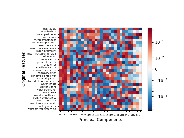
in action using first the original data as-is, then with a scaled version of
that data (via sklearn.preprocessing.StandardScaler).
|
|
Note that my function produces a transposed version of the original illustration now with original features labeled on the y-axis and principal components enumerated on the x-axis. With the original data, you can see clearly in the following image that some features do in fact contribute negatively, though those contributions are marginal.
With the scaled (i.e. zero-mean feature) data, postive and negative contributions have similar frequency. It many data model applications, data normalization is standard practice. In such cases, the flawed method of illustration would have resulted in ~50% of the data being misrepresented.
This implementation is also suited to cases where PCA is instantiated
with arguments, e.g. PCA(n_components=5), but that exercise is left up to
you, as is the exercise of trying the other combinations of signed and sort
arguments.

You May Also Like

Scramble Squares, Pt. 1/3: Constraint Programming
This is post 1 of a 3-post series on the Scramble Squares puzzle. This …
Simplex/Transformation Animation from INFORMS 2024 Annual Meeting Presentation
In this post, I provide the code for producing the animation above, …
The Mixed Integer 0-1 Knapsack Problem
Note: Thanks to Shraddha Ghatkar for pointing out an error in my …