Winter Storm Uri Visualization
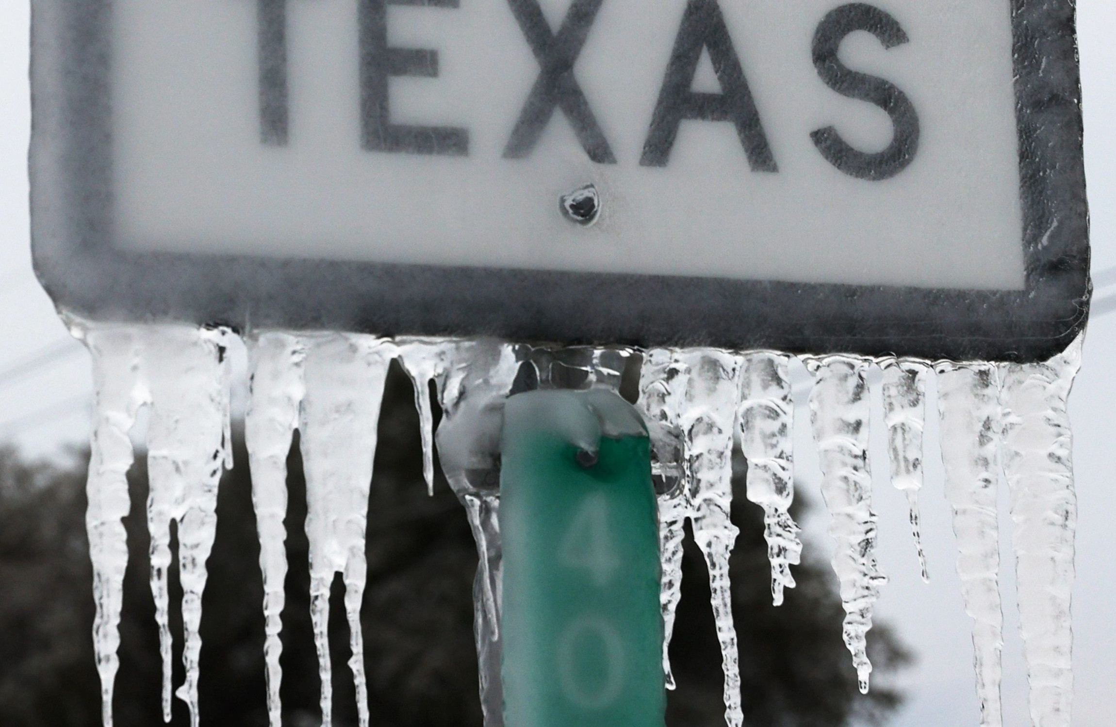
Do you remember just last year when the Texas grid was severely crippled by Winter Storm Uri? At the time, I was living in a South Austin apartment with my wife, and I will never forget. Our apartment lost power, cooled to 40°F, and flooded as a result of a burst pipe. Shortly after, my wife, who by-the-way was 40 weeks pregnant, started having contractions. We then navigated icy, unplowed roads to reach a hospital with no heat or water so that she could give birth to our son. Thankfully, mother and son both remained healthy, but the riveting experience is forever burned in my memory.
My PhD research revolves around grid resilience to extreme weather, so I was as much intrigued as I was perturbed by the catastrophic failures induced by Winter Storm Uri. This post, unlike most of others, is to publicize my online visualization of Winter Storm Uri and its impact on the electric power generators in Texas. This was a research direction I briefly pursued last year, but have yet to take further. The inspiration came from ERCOT’s Generator Outage Visualization App (EGOVA) that was developed by a researcher at Duke. Our goal was to augment the visualization with weather data and then identify correlations between the weather and outages.
In the visualization, you can use the radio buttons to switch between different weather overlays. You can also drag the time slider to transition through 10 days of hourly weather and minute-by-minute generator outages. Generator outages are illustrated by points colored to represent the generator types and sized to represent the absolute outage magnitudes. The visualization is missing a legend for the generator types, so those are as follows.
- red: natural gas
- black: coal
- white: wind
- yellow: PV solar
- green: nuclear
- blue: hydroelectric
- magenta: battery energy storage
I developed the visualization using generator outage and derate data from the Electric Reliability Council of Texas (ERCOT), historical temperature data from the National Oceanic and Atmospheric Administration (NOAA), and MERRA-2 temperature and humidity reanalysis data from the National Aeronautics and Space Administration (NASA). I used the MapBox graphics library to do the heavy visualization lifting.
The reanalysis data were defined on coarse grid cells, and so were easy to visualize. The historical data were from irregularly located weather stations, so I computed a Voronoi tesselation to construct weather regions based on proximity to the nearest weather station.
For those interested, my research into the event was not completely in vain, I just never ended up using the weather time-series data. I did contribute to a report published by The University of Texas at Austin Energy Institute and also author a pair of papers on the subject for the 2022 IEEE/PES Transmission and Distribution conference. In case you are not able to access the following resources, feel free to email me a request.

You May Also Like
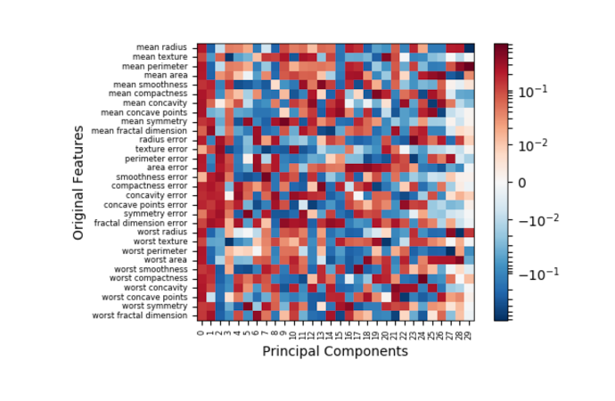
Principal Component Analysis
Recently, I worked on a project that necessitated data exploration and …

Scramble Squares, Pt. 1/3: Constraint Programming
This is post 1 of a 3-post series on the Scramble Squares puzzle. This …
Simplex/Transformation Animation from INFORMS 2024 Annual Meeting Presentation
In this post, I provide the code for producing the animation above, …